When deciding what to do with our group visual we had
trouble coming up with an idea at first. We wanted to make something
that would showcase what we learned this year, but we did not want to
make a 3D replication of any of the maps we did this year because we
did not feel it was original enough. As our group walked around the
craft isle of the store, we decided to look at the kids games for
inspiration. We saw an array of bright colors, characters, symbols,
and numbers. We threw a few ideas in the air, including a dart board
and 'the price is right' game, until one of us saw the game Yahtzee on
the shelf. We then decided we would make a giant dice and turn our
presentation into something fun rather than just a lecture.
As we started to build the giant dice, we discussed how we would
incorporate what we have learned into our presentation while rolling
the dice and landing on numbers 1-6. We discussed dual coding, and how
we should use symbols as well as words to explain to the class what we
have learned. We finally came to the conclusion that we would make a
colorful poster with the numbers 1-6 to go along with the dice, and as
we roll the dice we will select whatever image is behind the
corresponding number on our poster, and explain it to the class.
When putting together our presentation we used color, symbols, and
numbers, along with a little bit of talking aloud to help the class
dig into their long term memories. We hope that with our presentation,
the class will be able to recall what they learned about each of the
maps that we select, and that we will decrease the cognitive load with
our simple visual. By using "the least ink" possible, our message will
come through clearly, and our fellow students brain's will not be
cluttered with information and confusion during our presentation. In
the end, we realized that our visual is pretty simple. However, we
feel that being clear and to the point demonstrates everything we've
learned this year.
Personal Reflection:I enojoyed this project because it allowed me to really look back on what we had done throughout the year. I did not realize how much we really covered in a short period of time and am proud of the progress i've made in learning about visual communications. I have taken what i have learned and used it in other classes, especially when it comes to writing becuase I now have so many new techniques of brainstorming and organizing/explaining my information. I have seen much of what we have learned in real life examples on tv and in the paper. This project allowed me to be creative, which i enjoy doing. It was nice to reflect with my group members about what i have learned and what they have learned, and it was interesting to see the different points we got out of the class.
Monday, December 13, 2010
Monday, December 6, 2010
multivariate


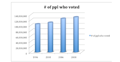
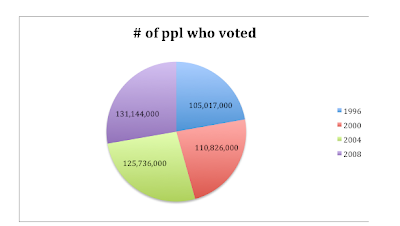
I decided to use statistics that were readily available for me so i visited the government burau website. I decided to tell a story with how many people have voted in the past 4 presidential elections. This information was easy to obtain and clear and to the point.
I first created a pie graph because i wanted to see the information related to a whole. On the pie graph, the 4 presidential elections number of voters seemed reletively equal. I decided to find another graph to tell the story better. I chose a bar graph and as you can see, it showed that as years have gone by, more people have voted. This tells the story that the United States is becoming more politically aware and politically involved.
I think using statistics and graphs work hand in hand and you in-fact can tell a story in a lot of cases. In this case, i can conclude that in the 2012 election, even more people will vote than in the 2008 elections. I think the statistics I found were a perfect example of telling a story because there was a trend.
Subscribe to:
Posts (Atom)