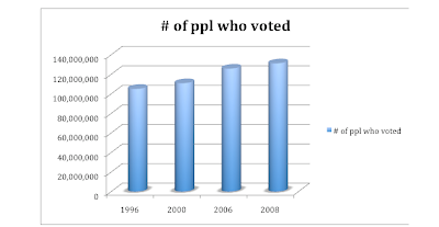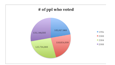

I decided to use statistics that were readily available for me so i visited the government burau website. I decided to tell a story with how many people have voted in the past 4 presidential elections. This information was easy to obtain and clear and to the point.
I first created a pie graph because i wanted to see the information related to a whole. On the pie graph, the 4 presidential elections number of voters seemed reletively equal. I decided to find another graph to tell the story better. I chose a bar graph and as you can see, it showed that as years have gone by, more people have voted. This tells the story that the United States is becoming more politically aware and politically involved.
I think using statistics and graphs work hand in hand and you in-fact can tell a story in a lot of cases. In this case, i can conclude that in the 2012 election, even more people will vote than in the 2008 elections. I think the statistics I found were a perfect example of telling a story because there was a trend.
No comments:
Post a Comment