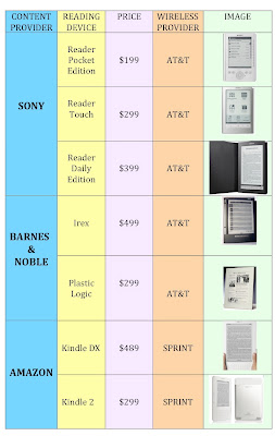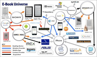


The original information graphic I found was called "E-Book Universal." It was a concept map about electronic readers and everything that has to do with them: their company, their wireless provider, etc. I knew it had potential for people who were looking to buy and electronic reader and wanted some information on each one, but there was too much information, and some of the most important information was left out. There were concepts floating in the map with no lines attatched to them so i did not know the relationship to the other concepts. Overall, it was just confusing.
My biggest struggle was trying to decide if it was okay to take some information out of the original and adding some more information that was not there in order to make a new graphic that would be better understood for my audience and decrease the cognitive load. After doing much research, i figured it would be okay.
I started doing a flow chart, and came to decide i would use 5 pieces of information. I then created a table on the computer to make it neat and organized. I used color, lines, words, and images to make a graphic that would be useful, especially for the working memory. I learned that using all of these things helps the memory, and that using dual coding and the gestalt principles will help you make a graphic that uses "the least ink" but sends your message across.
No comments:
Post a Comment