

After playing around with different type charts and graphs, it is easy to see which one conveys a lot of quantitative the best visually. I wanted to convey roger williams on campus crime in the past 4 years in an organized manner. My first simple chart is one of the four that i actually think works the best. It is simple, and the information is laid out right in front of you. There is no trying to understand what any lines mean or any confusion that may occur in other graphs.
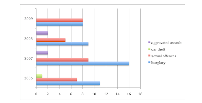
The next graph i did was the bar graph, and it is hard to read because some of the bars are put together and others are seperated as you can see. It makes the information confusing and it makes it hard to tell which bars belong to which category.
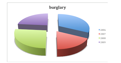
The next was a pie chart, and this works very well, but for each category seperated. If you wanted to look at 4 different pie charts for each category (burglary, assault, etc) or one pie graph for crime all together over the years, then a pie chart would be great.
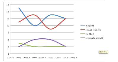
Lastly, i did a line graph and i feel that this works best. I had some technically difficulty because excel seperated the years into halfs as well. I did not know how to fix it because i am not great at excel, but overall the graph is organized you can compare the information. It is easy to read as well.
Overall, this assignment made me realize that there is not one graph or chart that works best in all cases. Each may work best in certain situations and how much information you are trying to show.
I forgot titles.. oops!
ReplyDelete