When deciding what to do with our group visual we had
trouble coming up with an idea at first. We wanted to make something
that would showcase what we learned this year, but we did not want to
make a 3D replication of any of the maps we did this year because we
did not feel it was original enough. As our group walked around the
craft isle of the store, we decided to look at the kids games for
inspiration. We saw an array of bright colors, characters, symbols,
and numbers. We threw a few ideas in the air, including a dart board
and 'the price is right' game, until one of us saw the game Yahtzee on
the shelf. We then decided we would make a giant dice and turn our
presentation into something fun rather than just a lecture.
As we started to build the giant dice, we discussed how we would
incorporate what we have learned into our presentation while rolling
the dice and landing on numbers 1-6. We discussed dual coding, and how
we should use symbols as well as words to explain to the class what we
have learned. We finally came to the conclusion that we would make a
colorful poster with the numbers 1-6 to go along with the dice, and as
we roll the dice we will select whatever image is behind the
corresponding number on our poster, and explain it to the class.
When putting together our presentation we used color, symbols, and
numbers, along with a little bit of talking aloud to help the class
dig into their long term memories. We hope that with our presentation,
the class will be able to recall what they learned about each of the
maps that we select, and that we will decrease the cognitive load with
our simple visual. By using "the least ink" possible, our message will
come through clearly, and our fellow students brain's will not be
cluttered with information and confusion during our presentation. In
the end, we realized that our visual is pretty simple. However, we
feel that being clear and to the point demonstrates everything we've
learned this year.
Personal Reflection:I enojoyed this project because it allowed me to really look back on what we had done throughout the year. I did not realize how much we really covered in a short period of time and am proud of the progress i've made in learning about visual communications. I have taken what i have learned and used it in other classes, especially when it comes to writing becuase I now have so many new techniques of brainstorming and organizing/explaining my information. I have seen much of what we have learned in real life examples on tv and in the paper. This project allowed me to be creative, which i enjoy doing. It was nice to reflect with my group members about what i have learned and what they have learned, and it was interesting to see the different points we got out of the class.
visual comm
Monday, December 13, 2010
Monday, December 6, 2010
multivariate
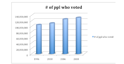
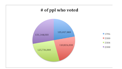
I decided to use statistics that were readily available for me so i visited the government burau website. I decided to tell a story with how many people have voted in the past 4 presidential elections. This information was easy to obtain and clear and to the point.
I first created a pie graph because i wanted to see the information related to a whole. On the pie graph, the 4 presidential elections number of voters seemed reletively equal. I decided to find another graph to tell the story better. I chose a bar graph and as you can see, it showed that as years have gone by, more people have voted. This tells the story that the United States is becoming more politically aware and politically involved.
I think using statistics and graphs work hand in hand and you in-fact can tell a story in a lot of cases. In this case, i can conclude that in the 2012 election, even more people will vote than in the 2008 elections. I think the statistics I found were a perfect example of telling a story because there was a trend.
Tuesday, November 30, 2010
Story Board
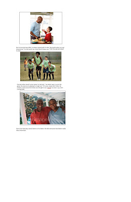
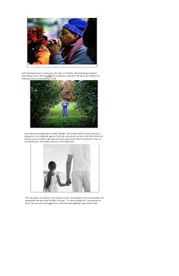
When doing the story boards I was first trying to use the photographs along with words to tell a story. Secondly, i wanted to use 2 of the pictures given to tell a story. I wanted to try to use as little words as possible, which was somewhat of a challenge.
I always thought writing comics would be easy. However, after doing the storyboards I realized that it is hard to tell a story with only using a few words. I did as best I could to get a short story going with a beginning, middle, and end. When I went to do the second story board, I thought how can any of these pictures possibly work together? After starring at them for about 5 minutes and digging into my imagination, I was able to come up with a funny story, and an inspiring story.
For the first story board, my first 2 pictures were scene to scene. The second and third picture were aspect to aspect because nothing really happens, but there is a moral to the story.
In my second story board, the first 2 pictures are moment to moment because it takes more than 2 frames to tell you what happens. However, the 2nd frame and 3rd frame are subject to subject because the 2 charachters interact with one another. I did not understand these transitions 100% but think as i look at more (and better) examples of professional storyboards I will get a better understanding.
Overall, I think writing comics or making storyboards can sometimes be harder then writing a full length story, because you want to say so much, but only have a little bit of space to do so. I can see how this is a helpful way to brainstorm for movie producers as well, especially with all of the different scene breaks.
Monday, November 15, 2010
rwu stats
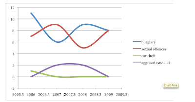
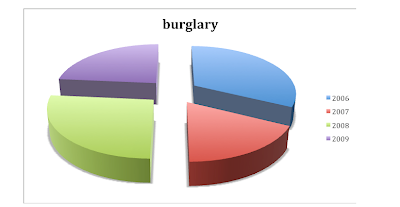
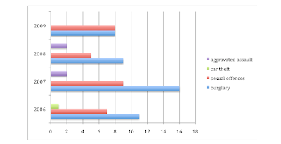

After playing around with different type charts and graphs, it is easy to see which one conveys a lot of quantitative the best visually. I wanted to convey roger williams on campus crime in the past 4 years in an organized manner. My first simple chart is one of the four that i actually think works the best. It is simple, and the information is laid out right in front of you. There is no trying to understand what any lines mean or any confusion that may occur in other graphs.
The next graph i did was the bar graph, and it is hard to read because some of the bars are put together and others are seperated as you can see. It makes the information confusing and it makes it hard to tell which bars belong to which category.
The next was a pie chart, and this works very well, but for each category seperated. If you wanted to look at 4 different pie charts for each category (burglary, assault, etc) or one pie graph for crime all together over the years, then a pie chart would be great.
Lastly, i did a line graph and i feel that this works best. I had some technically difficulty because excel seperated the years into halfs as well. I did not know how to fix it because i am not great at excel, but overall the graph is organized you can compare the information. It is easy to read as well.
Overall, this assignment made me realize that there is not one graph or chart that works best in all cases. Each may work best in certain situations and how much information you are trying to show.
Friday, November 12, 2010
Flow Charts

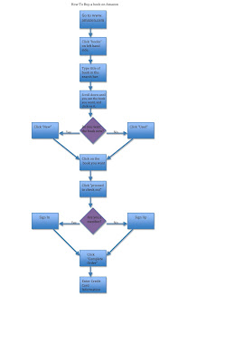

I was pretty familiar with how to buy a book but not at all with google scholar so that flow chart was a big more of a struggle. However, the first chart took so many trial and error sketchs. I was trying to make it as easy as possible for someone who knew nothing about ordering a book online. My drawn chart looked unorganized, and sloppy. So I decided to do it on the computer to make it neater. After a few sketches and going through the flow chart to make sure it worked, I finally completed my final copy on the computer.
Next, I started working on the google scholar one. I first made my self somewhat familiar with the tool then began to do the chart. This one was easier because I had dont so many trial and errors with the first flow chart that I knew the basic format that looked the neatest and worked best when it came time to do this one. I don't think this chart is 100% perfect but as I become more familiar with the google scholar tool I will be able to make a better flow chart.
This project really showed me that flow charts need to look organized or they will not work in decreasing the cognitive load. All of the boxes and lines need to be the same size and in line with one another, and this actually does help the viewed get to where they need to be faster.
Tuesday, November 9, 2010
information graphic paper
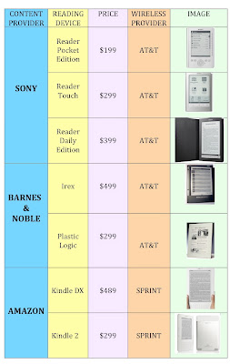

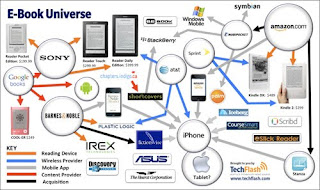
The original information graphic I found was called "E-Book Universal." It was a concept map about electronic readers and everything that has to do with them: their company, their wireless provider, etc. I knew it had potential for people who were looking to buy and electronic reader and wanted some information on each one, but there was too much information, and some of the most important information was left out. There were concepts floating in the map with no lines attatched to them so i did not know the relationship to the other concepts. Overall, it was just confusing.
My biggest struggle was trying to decide if it was okay to take some information out of the original and adding some more information that was not there in order to make a new graphic that would be better understood for my audience and decrease the cognitive load. After doing much research, i figured it would be okay.
I started doing a flow chart, and came to decide i would use 5 pieces of information. I then created a table on the computer to make it neat and organized. I used color, lines, words, and images to make a graphic that would be useful, especially for the working memory. I learned that using all of these things helps the memory, and that using dual coding and the gestalt principles will help you make a graphic that uses "the least ink" but sends your message across.
Tuesday, November 2, 2010
spagetti dinner

When I first found out we had to draw how to make a spaghetti dinner, I was dreading doing it because i CANNOT draw. I thought of ways that i could get around drawing out all of the steps of making a spaghetti dinner, but figured there is really no other way other than using symbols so that many people can understand it. I decided to take it step by step and just do the best i could.
I started with the first step, of getting a pot and boiling water. I continued with all of the steps needed to cook spagetti. I was doing good until i thought, how will people know when to stop stirring the spaghetti while its boiling? This step took me a few minutes to figure out, and after drawing a stiff piece of spaghetti and a curly piece, i figured if it was drawn professionally, the audience would get the point.
This project made me realize that sometimes, using words improves the cognitive load. For some reason i associated words with confusing and a lot on the brain, but in this case, I think using words (if you knew what language would be reading it) would have been the easiest and quickest way to describe these steps.
Subscribe to:
Comments (Atom)